Life sciences / Visual identity
Science, with a human signature.
A cellular mark opens into a warmer, more expressive identity for life sciences.
Visual identity
Stationery
Brand applications
The thinking behind the work
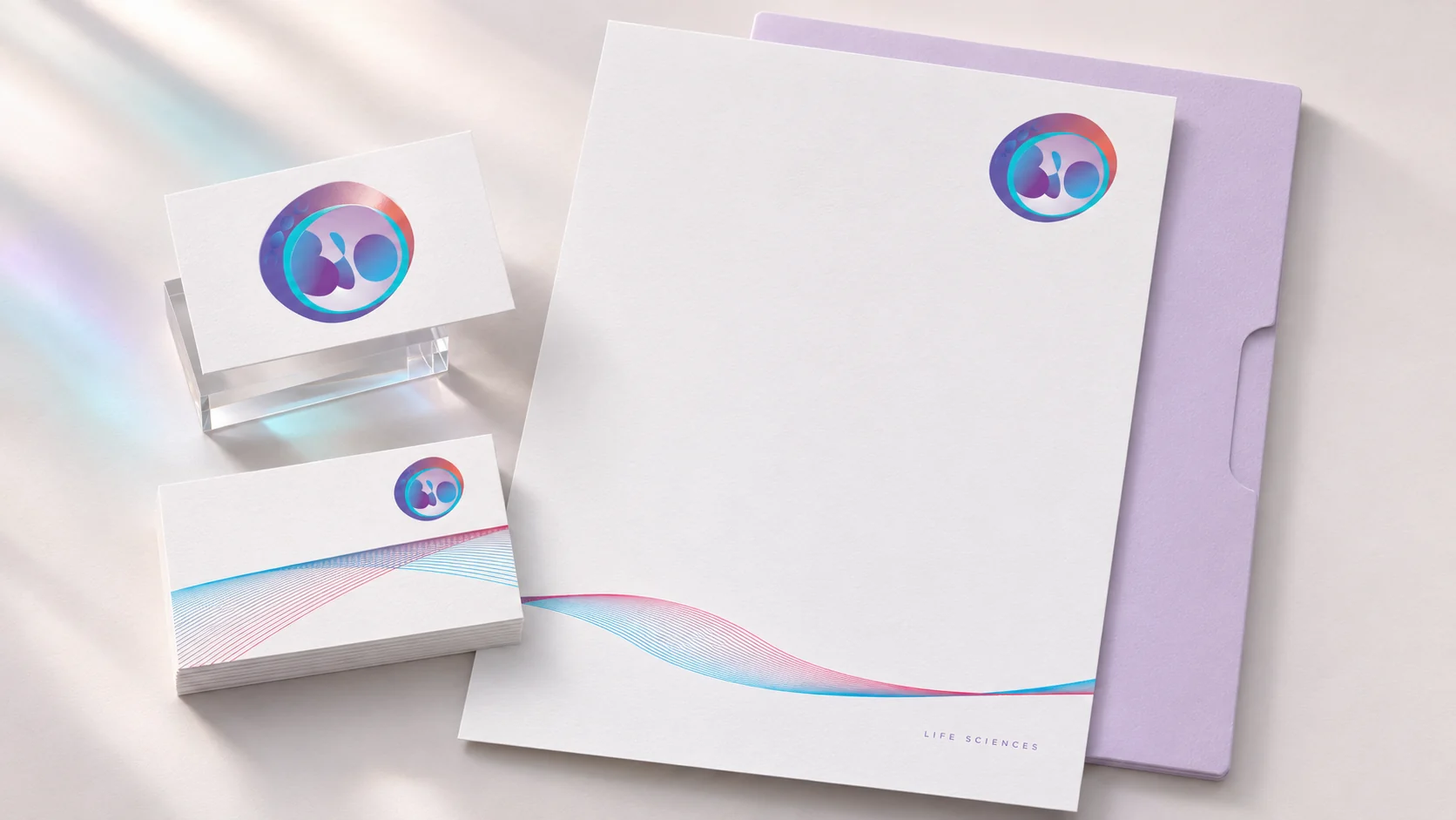
The symbol starts with a biological idea and gives it an approachable form. Colour moves through the mark; fine lines let that movement travel across the page. On stationery, the identity can be quiet enough for a letter and distinctive enough for a first introduction. The interesting work happens between those scales: a recognisable centre, supported by a visual language that does more than repeat the logo.
From the archive, presented today
The original design was created before 2023. This contemporary mockup revisits the work with client names and identifying copy withheld. Staging, materials and supporting applications are presentation treatments rather than claims about production delivery.