Hospitality / Amenity packaging
Hospitality lives in the small things.
A compact packaging direction that makes an everyday amenity feel considered.
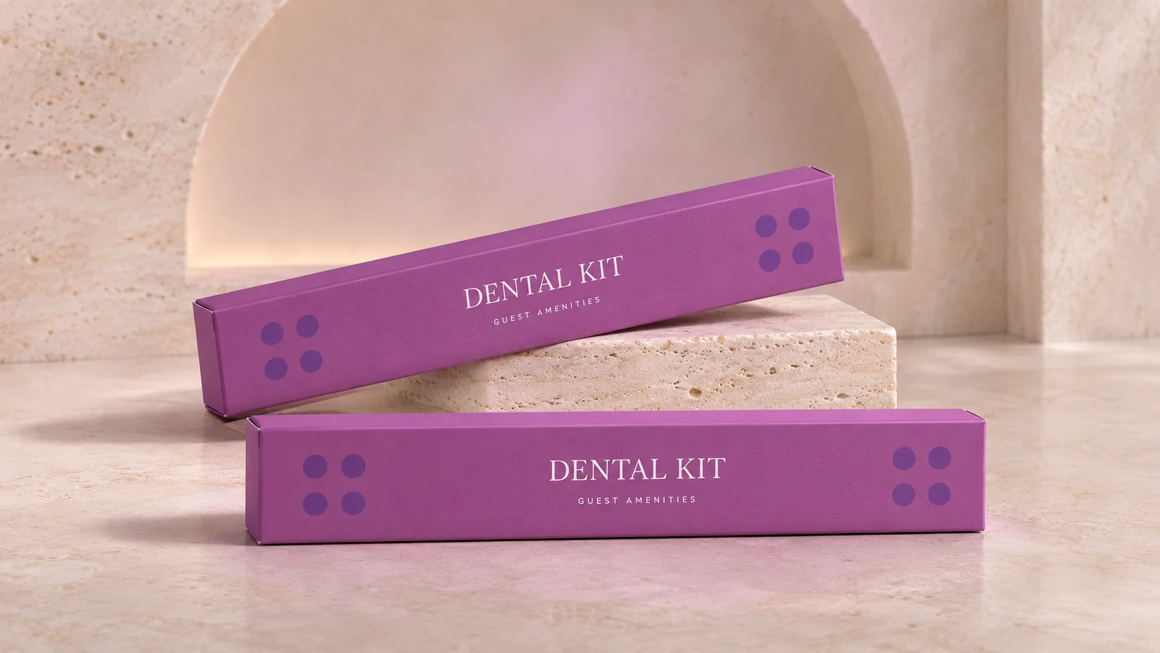
Packaging design
Typography
Hospitality applications
The thinking behind the work
A dental kit may be a small part of a stay, but its packaging still belongs to the larger brand experience. A mauve field, white serif type and a four-dot motif give this carton a simple, recognisable structure. The design holds the product name clearly and uses the remaining space with restraint. It is a reminder that a visual identity is also built through the objects people encounter briefly.
From the archive, presented today
The original carton artwork predates 2023. Hotel identity is withheld. Folding, material finishes and the stone setting are contemporary presentation treatments.