Creative services / Promotional design
Let the idea take up space.
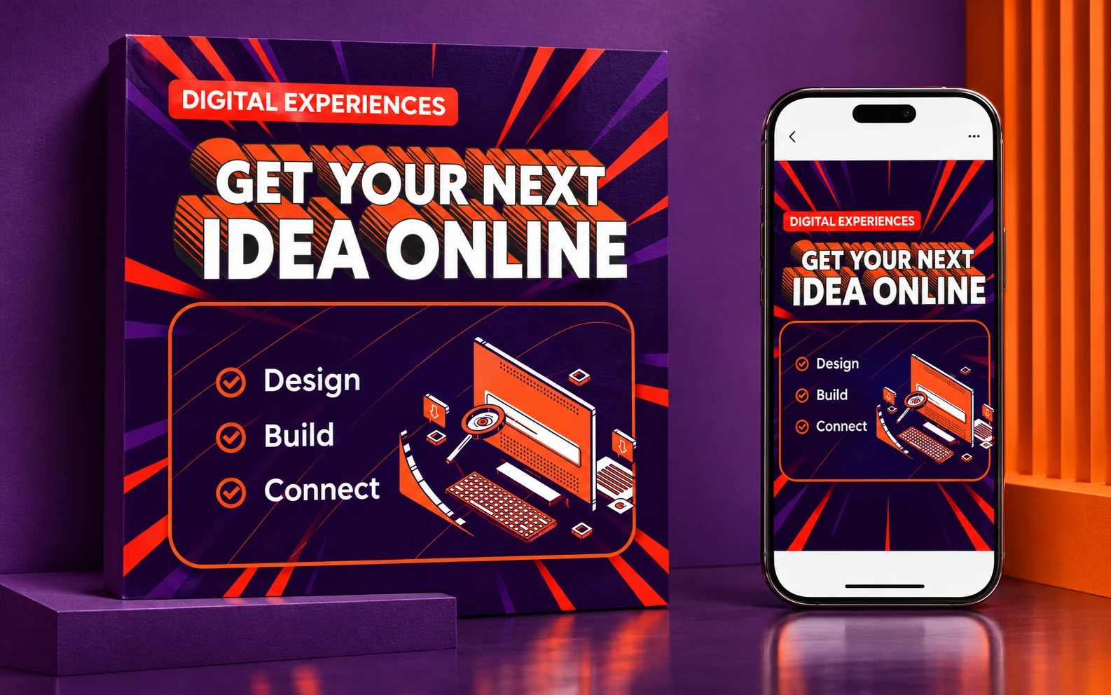
Expressive type and isometric imagery give a studio promotion a more animated presence.
Promotional creative
Display typography
Campaign direction
The thinking behind the work
Extruded lettering makes the headline feel physical. An isometric computer illustration connects that playfulness to the work of a digital studio, while radial accents introduce direction and pace. Purple and orange carry the visual contrast through the composition. The original creative gives the promotion a distinctive voice; its current presentation shows how that direction can hold together across a proof and a portrait screen.
From the archive, presented today
The original design was created before 2023. This contemporary mockup revisits the work with client names and identifying copy withheld. Staging, materials and supporting applications are presentation treatments rather than claims about production delivery.