Consulting / Visual identity
A centre that opens into a system.
A radial symbol gives a consulting identity both a recognisable mark and a broader graphic language.
Visual identity
Brand vocabulary
Stationery direction
The thinking behind the work
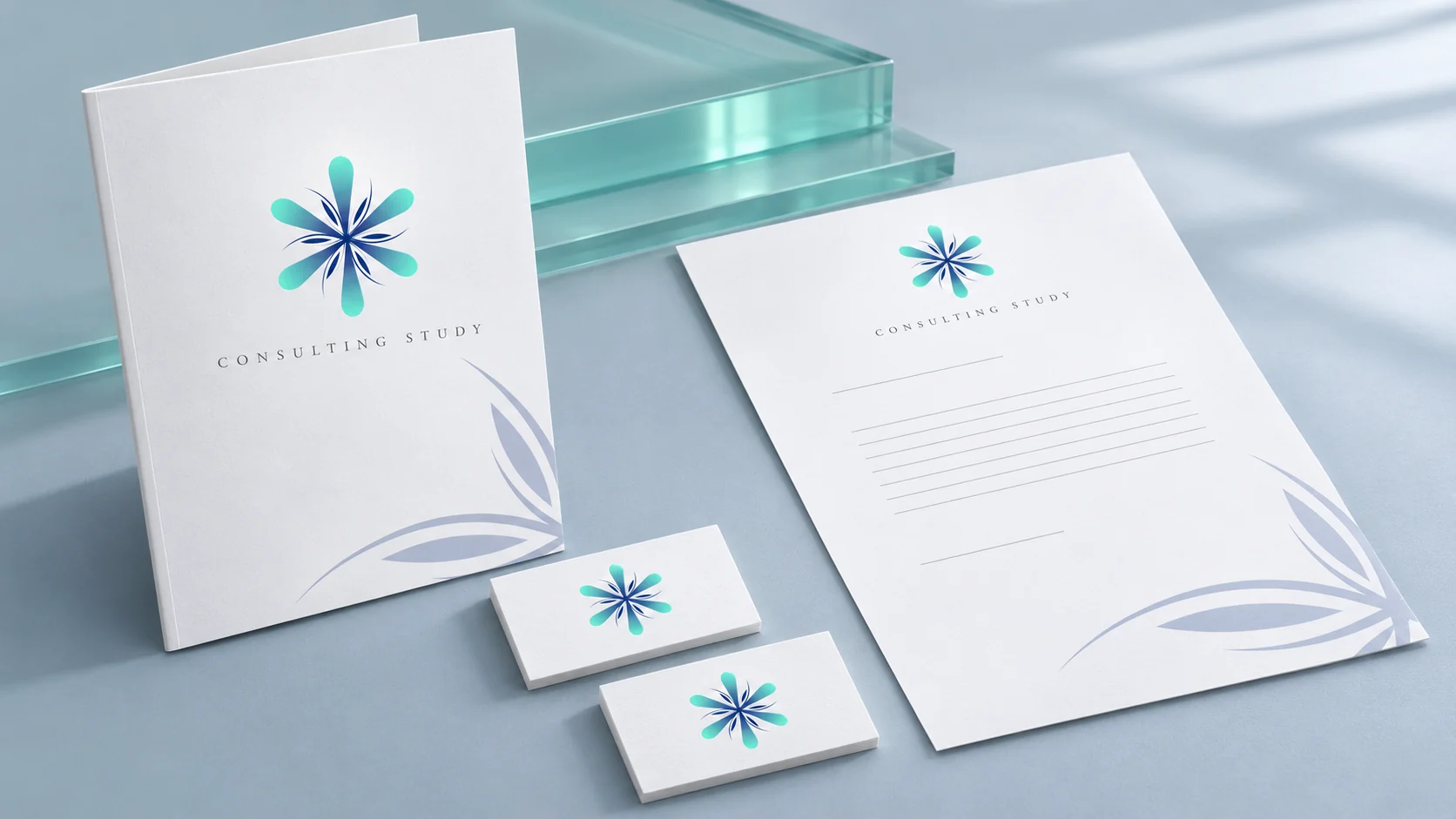
Aqua-to-navy petals and fine leaf-like forms gather around a shared centre. That radial structure gives the mark its character, while enlarged fragments create a softer supporting pattern. The identity can be complete and compact on a card, or more expansive across a larger page. The design explores that range without adding unrelated decoration: the supporting expression grows from the same idea as the symbol.
From the archive, presented today
The original design was created before 2023. This contemporary mockup revisits the work with client names and identifying copy withheld. Staging, materials and supporting applications are presentation treatments rather than claims about production delivery.