Professional services / Identity
Build the language into the mark.
A geometric symbol becomes the starting point for a complete visual vocabulary.
Visual identity
Pattern systems
Stationery
The thinking behind the work
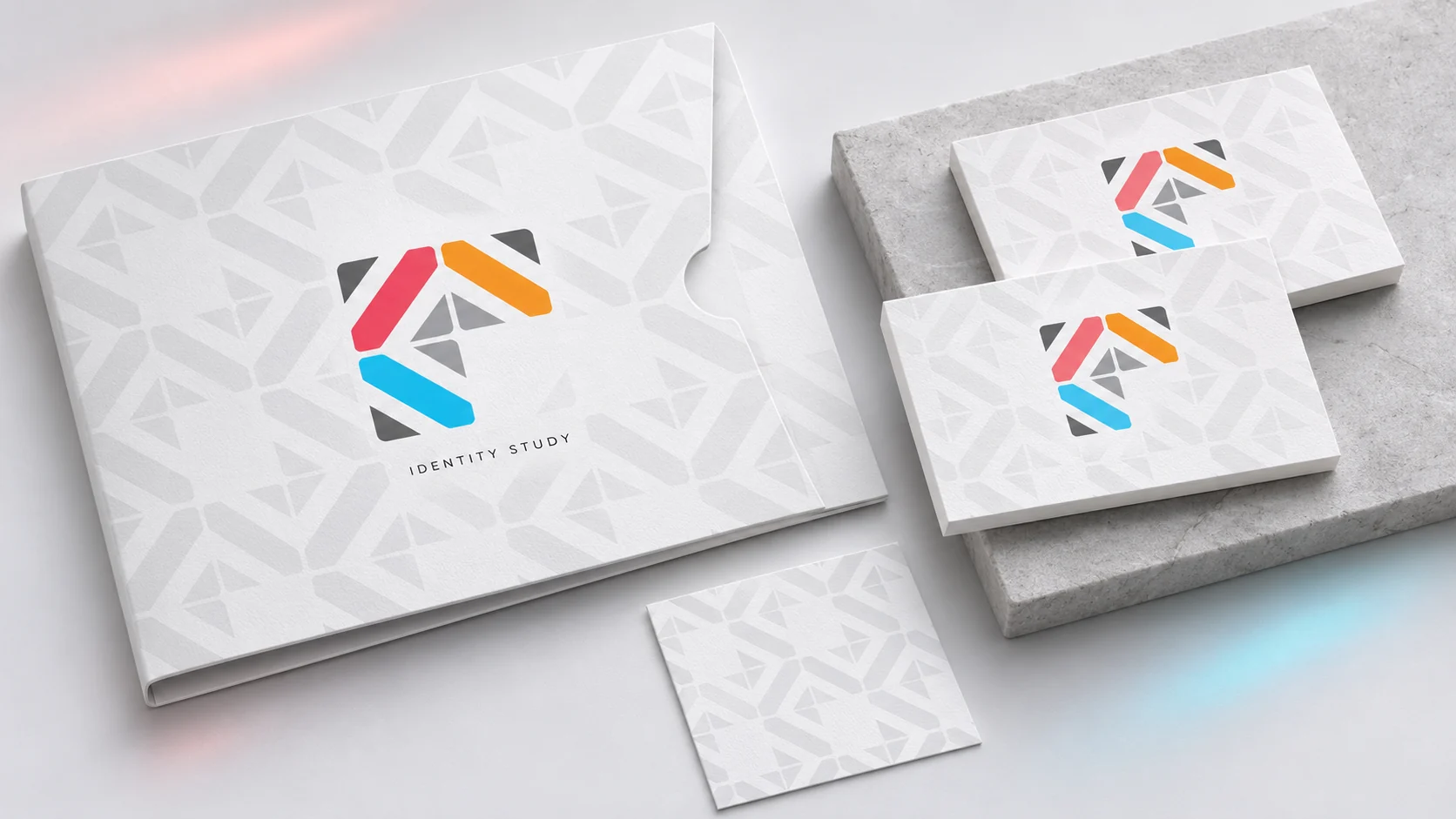
The mark contains the ingredients for the wider identity: angular geometry and a balance of coral, orange, cyan and grey. Repeating those ingredients creates patterns that feel related without needing the whole logo at every turn. Stationery gives the system different scales to work with. The idea is simple but useful: recognition can live in the supporting language as much as in the signature itself.
From the archive, presented today
The original design was created before 2023. This contemporary mockup revisits the work with client names and identifying copy withheld. Staging, materials and supporting applications are presentation treatments rather than claims about production delivery.