Beverages / Label design
A label with a sense of flow.
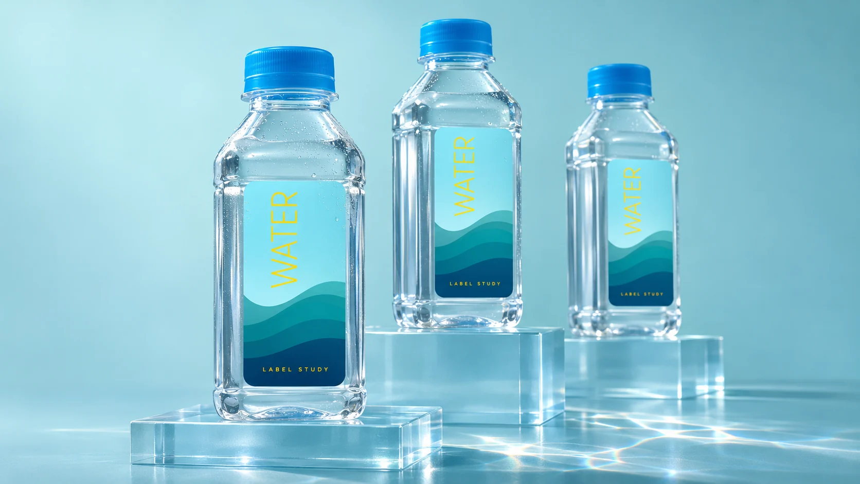
Layered waves and a fine typographic accent create a fresh direction for a familiar product.
Label design
Colour hierarchy
Product presentation
The thinking behind the work
Water gives the label its visual starting point. Cyan establishes the field; overlapping teal waves introduce depth and movement; a small yellow typographic accent creates a point of contrast. The design uses those few elements to organise the bottle rather than fill every available space. Its character comes from their relationship: an uncomplicated hierarchy with a recognisable rhythm around the product.
From the archive, presented today
The original label design predates 2023. Brand and manufacturing details are withheld. The bottle mockup is a later presentation treatment, with descriptive replacement copy.